ITS ALL IN THE NAME - ALCEMI
Naming your business is almost as important as naming a child, you dont want to choose the wrong name! I came across the word Alchemy a few years before when I used to write lists for creative focus, for when I finally got myself into gear to get creative again. So it was always in the back of my mind as a word I liked.
When I started exploring abstract painting and learning through exploration, trials, errors, trying different approaches, it felt like a creative alchemy in play. The word Alchemy resonated enough for it to become the name of my creative business. I also wanted Alcemi to act as an umberella name for various creative skills that I hope to develop in the future (photography/textiles/wood).
I love what Alchemy means and represents, the creative process, discovery, experiments to ultimately create gold.

ALCHEMY SYMBOL FOR GOLD
Two Concentric Circles
Gold circles often appeared in my work in the early stages of my creative journey in 2021.
In the early stages of setting up Alcemi Art, I had to put a lot of thought into a designing a logo. I felt I had enough design experience to try and create one myself. It has been a process I can tell you and even more time than any of my paintings! I found myself fascinated driving or walking around looking at logos on vans, lorries, shops, on TV, questioning why they chose the design, how it related to what they did and their story.
My criteria was to create a logo that related to my botanical interests, without looking like a florists or garden centre logo! I wanted it to express a timeless and contemporary quality, botanical elegance and luxury. Also with a nod to the infamous BIBA logo that I love and towards the art nouveaux style, as my colour palettes relate to painting palettes from that era.
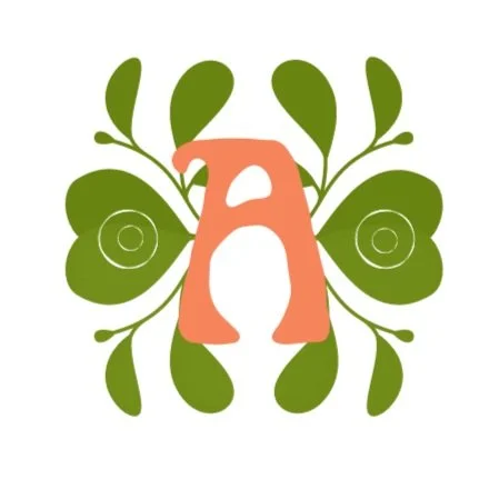
THE LOGO ELEMENTS
My favourite colour is green, moss green to be specific. So it is no wonder that I am drawn to nature and love plants really! Hence, the colour being a key feature of the logo.
I opted for one A rather than two, as I didn’t want to look like Alcohol Anonymous or RAC AA Route finder! My chosen capital A is in font style Art Nouveaux, its a style I feel is a bit organic, creative and qwerky just like me, and coloured peachy pink to relate to my signature pink hair!
The 2 alchemy gold symbols are symbolic for the two significant creative chapters of my life, from 1995 - 2000 and 2021 to present day.
The leaves cross over to create a heart shape, which is to relate to my heart centred process where all my paintings derive from, also the feeling art stimulates in the heart when you enjoy artwork.
As Professor Semir Zeki, Neurobiologist at London University says: “Viewing beautiful artwork can actually cause you to experience the same physical reactions we get when we fall in love”.
What more can I say, other than I hope that explains my logo story and what it means!
May 8th 2023